Run Wild
A not-for-profit race created by Edmonton’s Leading Edge Physiotherapy.
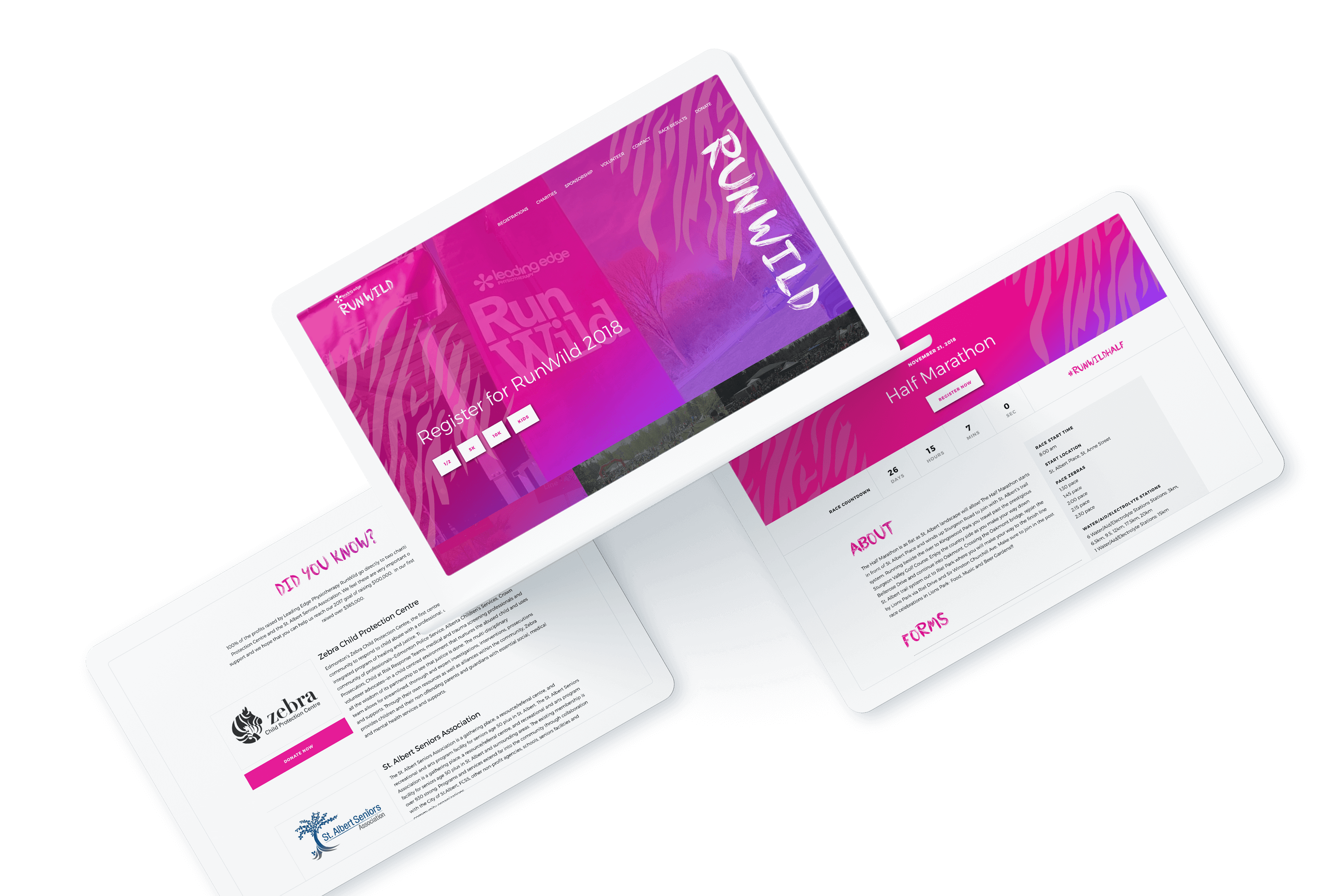
Leading Edge wanted to create a website that would help them meet their fundraising goals and that would be easy for users to navigate. They wanted a design that would be modern and fun, and would look good for years to come.

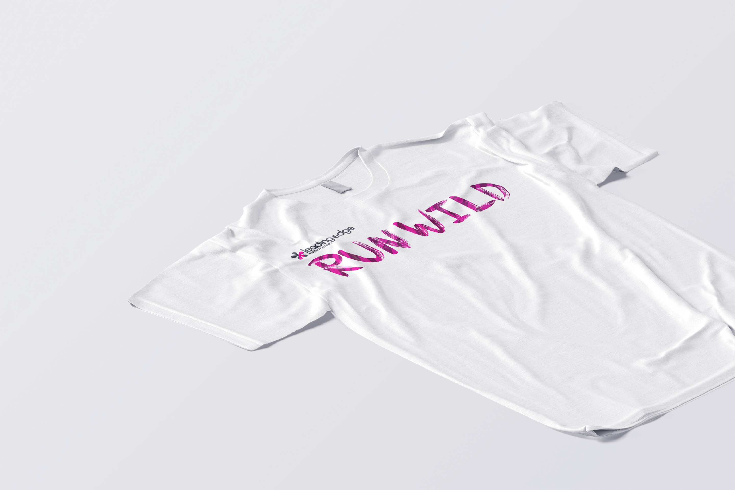
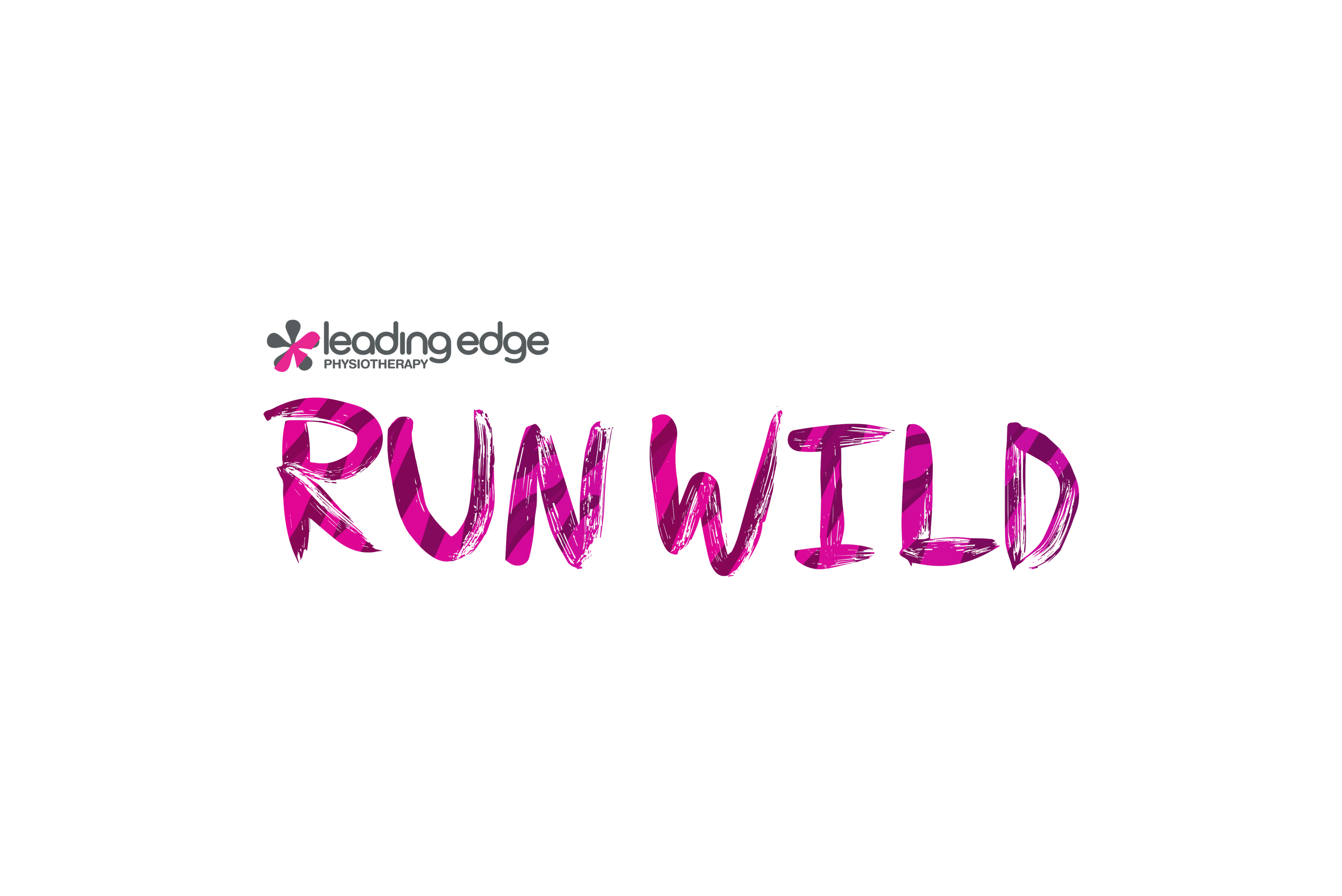
The old website did not emphasize the fun, wild, and exciting aspect of the Run Wild brand. I wanted to play up the “wild” part of the name by choosing a font that was more distressed and utilizing bright gradients and animal prints.

It gave Leading Edge as a company more versatility as their current website shows that on the forefront, they are a more formal business. The RunWild event shows that they have a more playful side. The design was created with the intent of attracting people because of it’s wildly different and stand out design.