Italian Centre
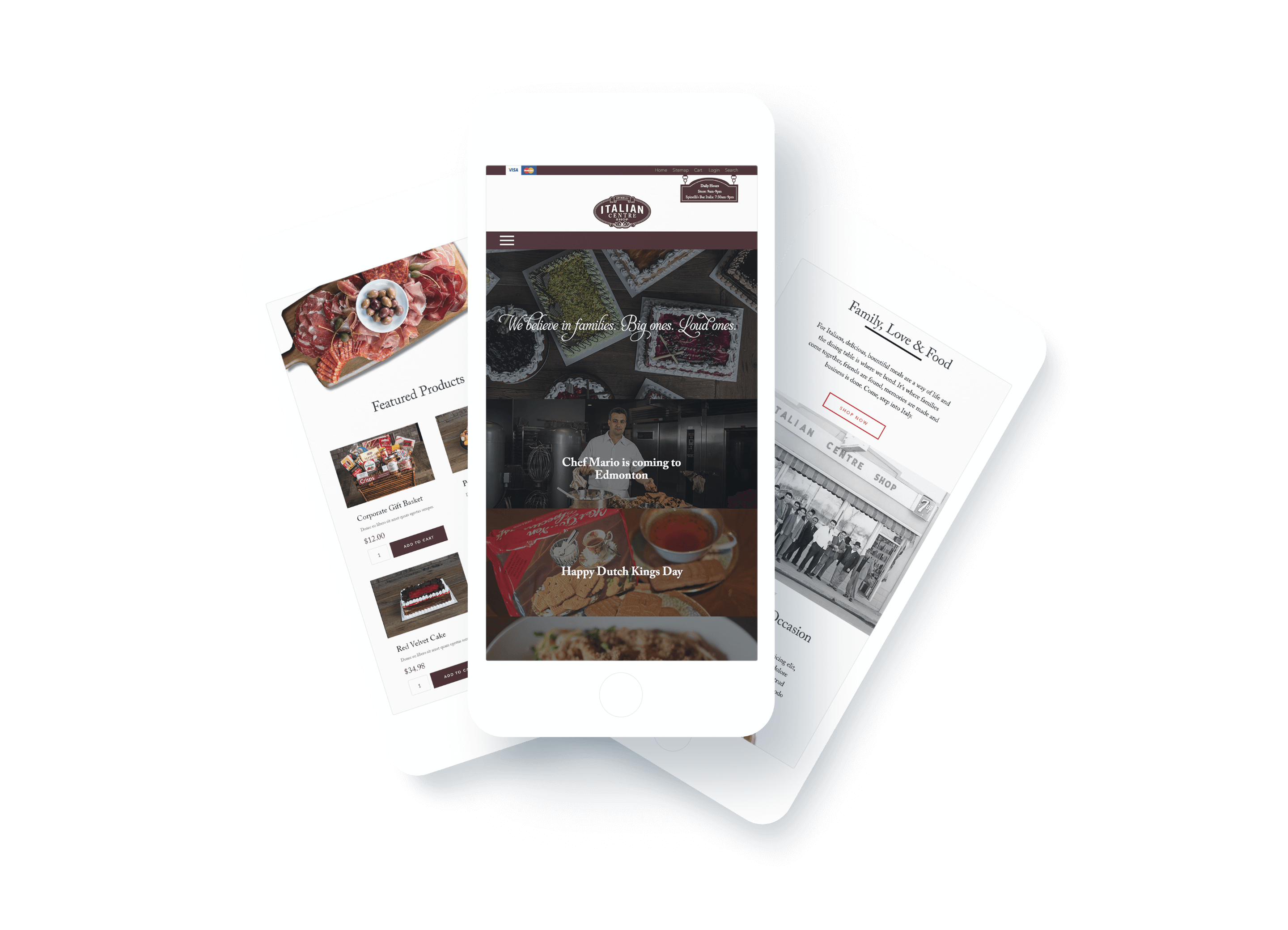
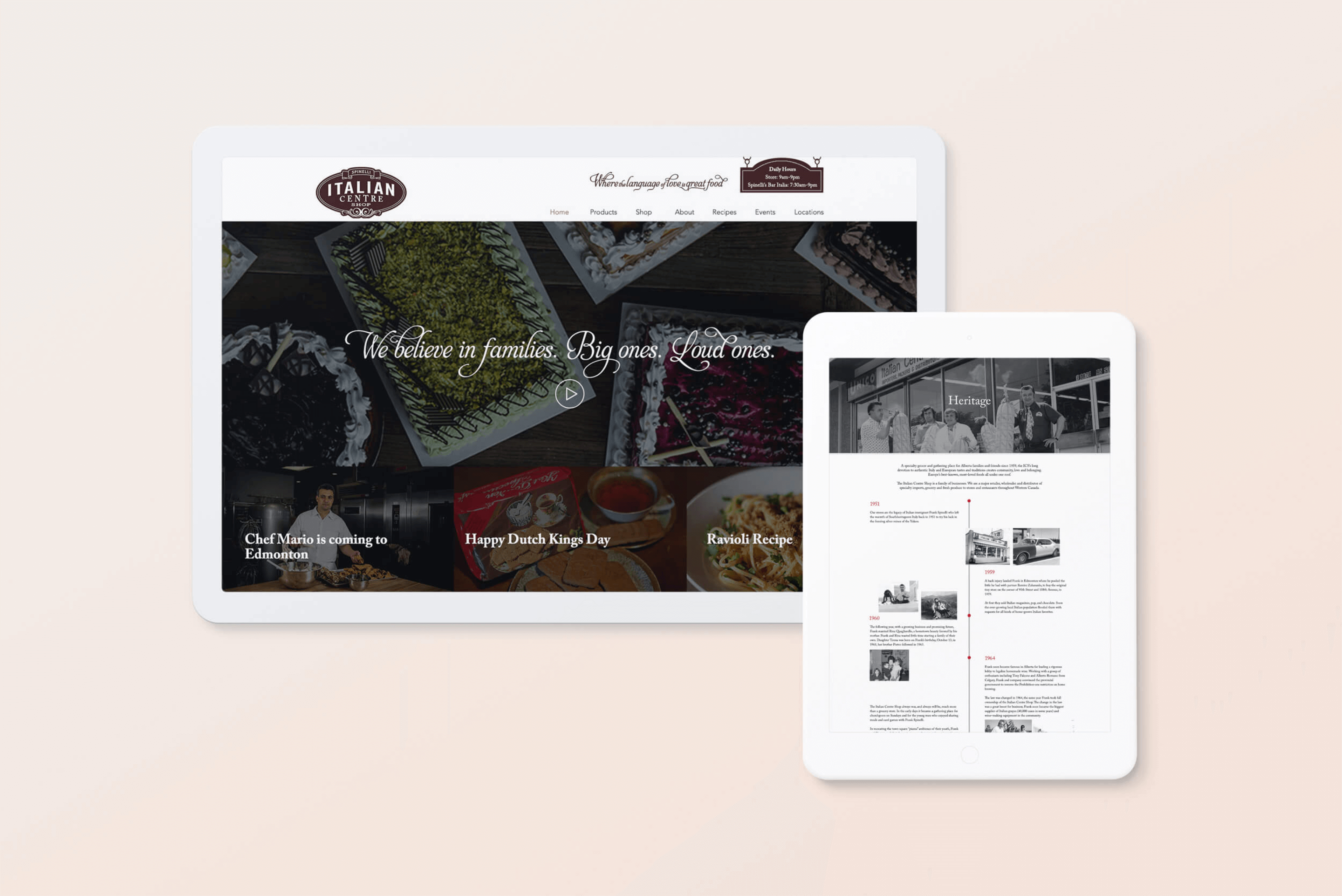
The Italian Centre, one of Edmonton’s most popular grocery stores, wanted a website that would improve their online store. They wanted to create a look that was modern but still celebrated their rich history.
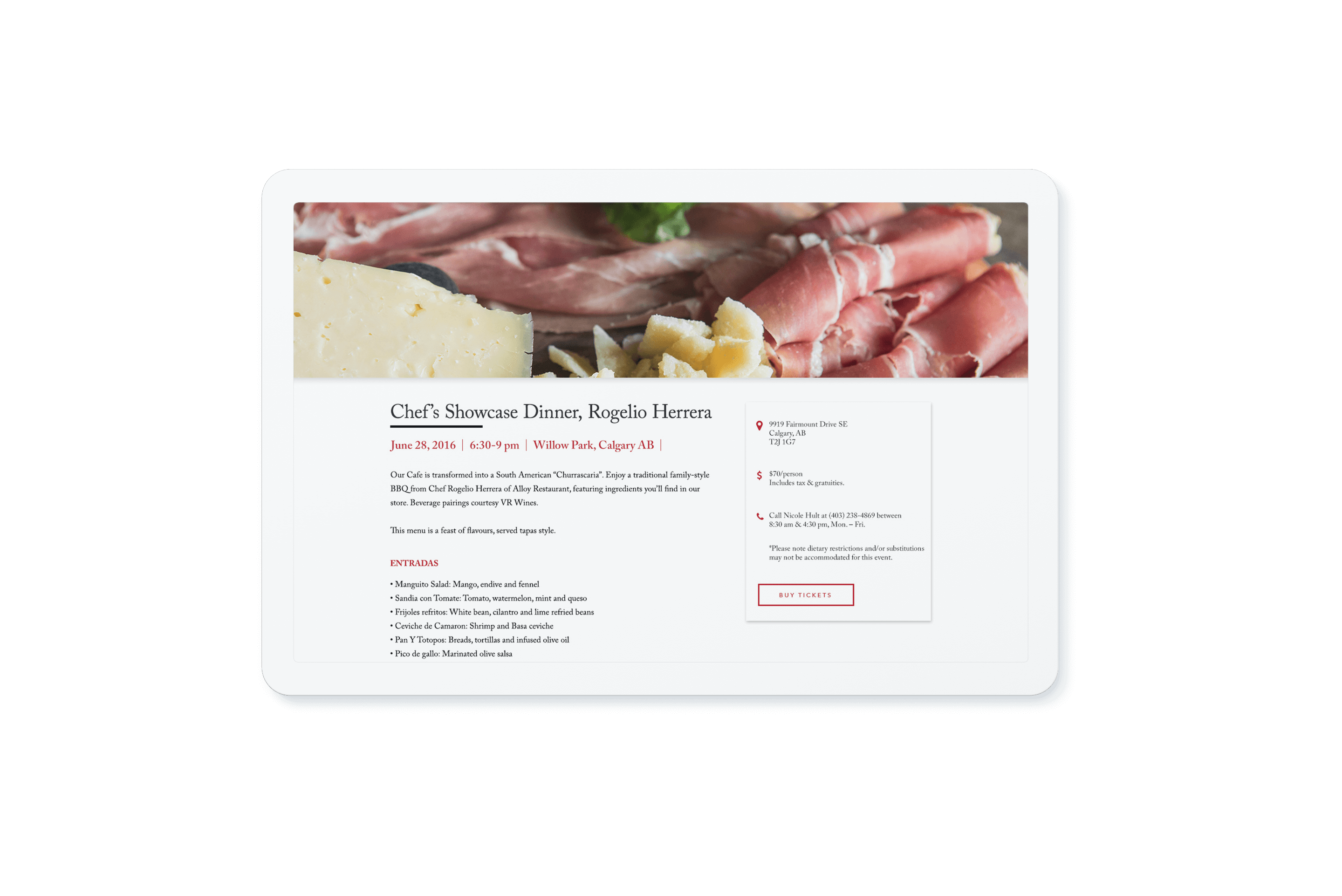
Creating a culinary education was one of the many goals of the website. By featuring blogs, recipes, and cooking classes, users would be more informed about the activities happening at each location. The Italian Centre also wanted to see an increase in sales by 25%. We created a seamless ordering experience while creating more complex configurable products for customers.

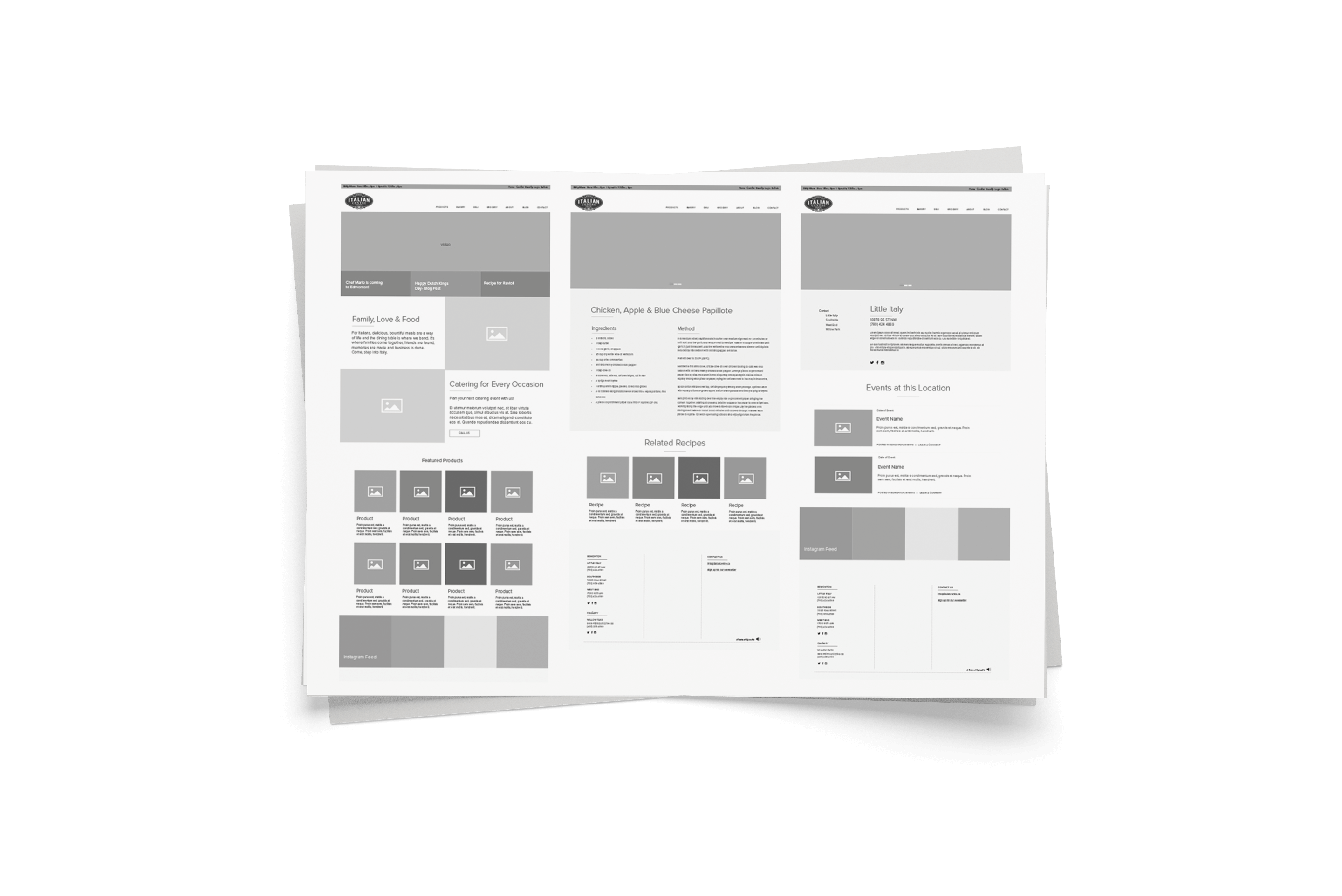
Interviews with each department (Bakery, Deli, HR, etc) were conducted to see how the website could improve their work days. This gave us perspective as to how each department would be using the website and allowed us to design certain pages, forms, and templates that would work for each group.

